CLEAN & FRESH
FULLY RESPONSIVE
DESIGN
better viewing on all devices
easy reading and easy navigation
mobile-ready gives better SEO rankings
WORDPRESS
WEBSITES OR BLOGS
CONTENT MANAGEMENT
SYSTEMS
WordPress is: search engine friendly
very flexible and easy to learn
mobile-ready and widely supported with plugins

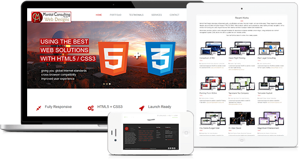
USING THE BEST
WEB SOLUTIONS
WITH HTML5 / CSS3
giving you: global Internet standards
cross-browser compatibility
improved user experience

Fully Responsive
Day by day, the number of devices, platforms, and browsers that need to work with your site grows. Responsive web design represents a fundamental shift in how we'll build websites for the decade to come. Mentat websites are all responsive and are built for optimum viewing on Small + Medium + Large screen sizes.
Whether your site is being viewed on a Desktop, Laptop, Tablet or Smart-Phone - whether it is the large version or the small one - whether it is seen horizontally or vertically, Mentat's web site designs will adjust gracefully to fit.
HTML5 + CSS3
HTML5 and CSS3 have swept the web by storm in only 2 years. It is important that your website is built using these tools, because that means your site will use global Internet standards and will render properly in modern browsers (ie: cross-browser compatibility).
It will have easy-to-access information - not just for human readers, but for search engine crawlers and indexing bots (which is good for your SE rankings). This coding style will give you an overall improved user experience with potentially less disruptions from one device to another.
Launch Ready
Website Planning, Design, Development and Optimisation:
Whether you are revamping your existing website or creating a new one, Mentat designed websites offer a seamless design that coordinates with your business vision.
Optimizing your website ensures that it doesn't just sit on the Internet. It does what it's supposed to do: attract customers.
Mentat Websites are Fully Responsive
How can you tell a site is mobile-ready?
- The site adapts the layout to the viewing environment
- Websites are designed using fluid, proportion-based grids, flexible images, and CSS3 media queries
- The user does not have to manipulate the site using "pinch and zoom" and the flow of content is more appropriate for a smaller screen
- Mobile environments require simpler navigation, focused content and fast page loads.
- The websites will work on next year's devices - even with the vast number of devices emerging in the market place
- No need for a separate mobile site, app or plugin

Why Do You Need A Responsive Website?


Being Mobile Ready!
The adoption of mobile devices continues to grow very rapidly and this means that more and more users will be using their mobile browsers to view your web site.
If you've ignored previous warnings and your business isn't taking advantage of responsive web design right now or planning on it in the very near future, you are in danger of losing business. Getting a responsive website should be your primary online marketing goal.
Perhaps the most compelling reason to ensure that your small business site is a responsive website is Google. The world's most popular search engine, which currently owns 83 percent of the mobile market share, stated in 2012 that its algorithms prefer responsive design.
Mobile friendliness is a ranking criteria for websites on Google. The algorithms will favour mobile-friendly sites and penalise sites that display poorly on mobile devices. A website that is not a responsive website or mobile-friendly will suffer negative SEO and decreased search engine rankings.
How are your customers accessing your small business website? And more importantly, what does it look like when they do?
The simple fact is that mobile device usage is on the rise. Last year marked the first time when mobile Internet traffic surpassed desktop traffic. It isn't enough to simply state that more and more people are using smartphones today. The overwhelming statistic that ties it all together is this one: 70% of searches performed on mobile devices will lead to action on websites within one hour. People are constantly seeking information, and they are using their mobile phones more and more to do so. And in fact - people are using their smartphones to make decisions about the products and services they will purchase. User experience is critical - and if your website isn't ready for your mobile audience, you are going to start losing real business.
What this means for your small business is that more customers are finding your website using mobile devices. And if it's not optimized for mobile viewing, they're clicking away to your competition. The best way to ensure a seamless mobile experience for all of your website visitors is by using responsive web site design.
If you are ready to increase your website exposure on search engines - by getting a responsive website, click on the 'contact us' button below, and ask for a free, no obligation quote.
Mentat Web Designs
Mentat Web Designs develops professional quality, yet affordable web sites, that look modern, and are mobile-ready. These responsive website are designed for desktops, laptops, tablets and smartphones. For content management system (CMS), Mentat provides creative custom designed templates for responsive wordpress websites and blogs.
Site Map
Contact Us
Elsternwick, VIC, 3185
(Melbourne Australia)
Mobile: 0413-459-379
Email: info@mentat.com.au
Some of our local Service Areas in the inner south-eastern suburbs of Melbourne Australia:
Bayside Beaumaris
Copyright 1999-2024 © Mentat Web Designs All Rights Reserved.